USAHello 2024
Making learning accessible with a mobile-first Classroom redesign
I led a ground-up redesign of USAHello Classroom to improve sign-up conversion, reduce usability friction, and increase learner engagement - especially for mobile-first users.
USAHello is a nonprofit platform that connects more than 3.5 million immigrants each year to multilingual information and resources across their ecosystem of products. USAHello Classroom is their educational platform offering free self-paced classes. At the time of the redesign, the Classroom primarily offered GED exam preparation, with a U.S. citizenship exam prep class in the works.
I served as the lead product designer, owning the end-to-end experience across information architecture, UX, UI and onboarding.
Challenge
The Classroom struggled with low sign-up conversion and frequent support requests, limiting its reach and impact. Core usability issues, inconsistent messaging, and a confusing site structure created friction during sign-up and early use.
These issues were amplified on mobile. Despite roughly 70% of traffic coming from mobile devices, the experience did not adapt well to smaller screens, likely contributing to drop-off and user confusion.
With the redesign USAHello hoped to increase Classroom sign-up conversion and improve learner activation, with a goal of 40% of learners starting at least one class within their first month after signing up.
Solution
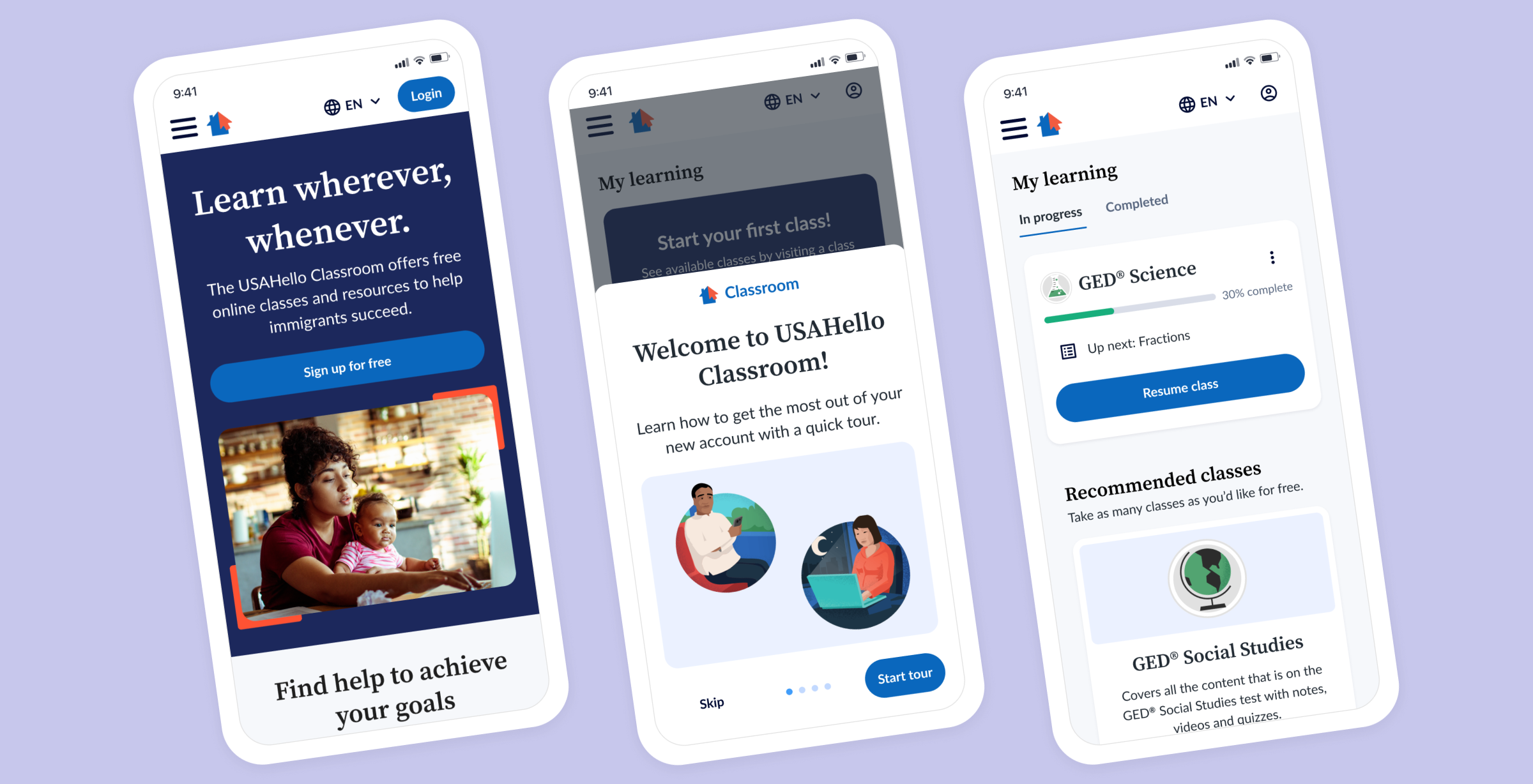
I delivered a new Classroom experience centered on clarity, trust, and accessibility. The redesigned flow made it easier for learners to understand the value of the Classroom, sign up with confidence, start classes, track progress, and continue learning over time.
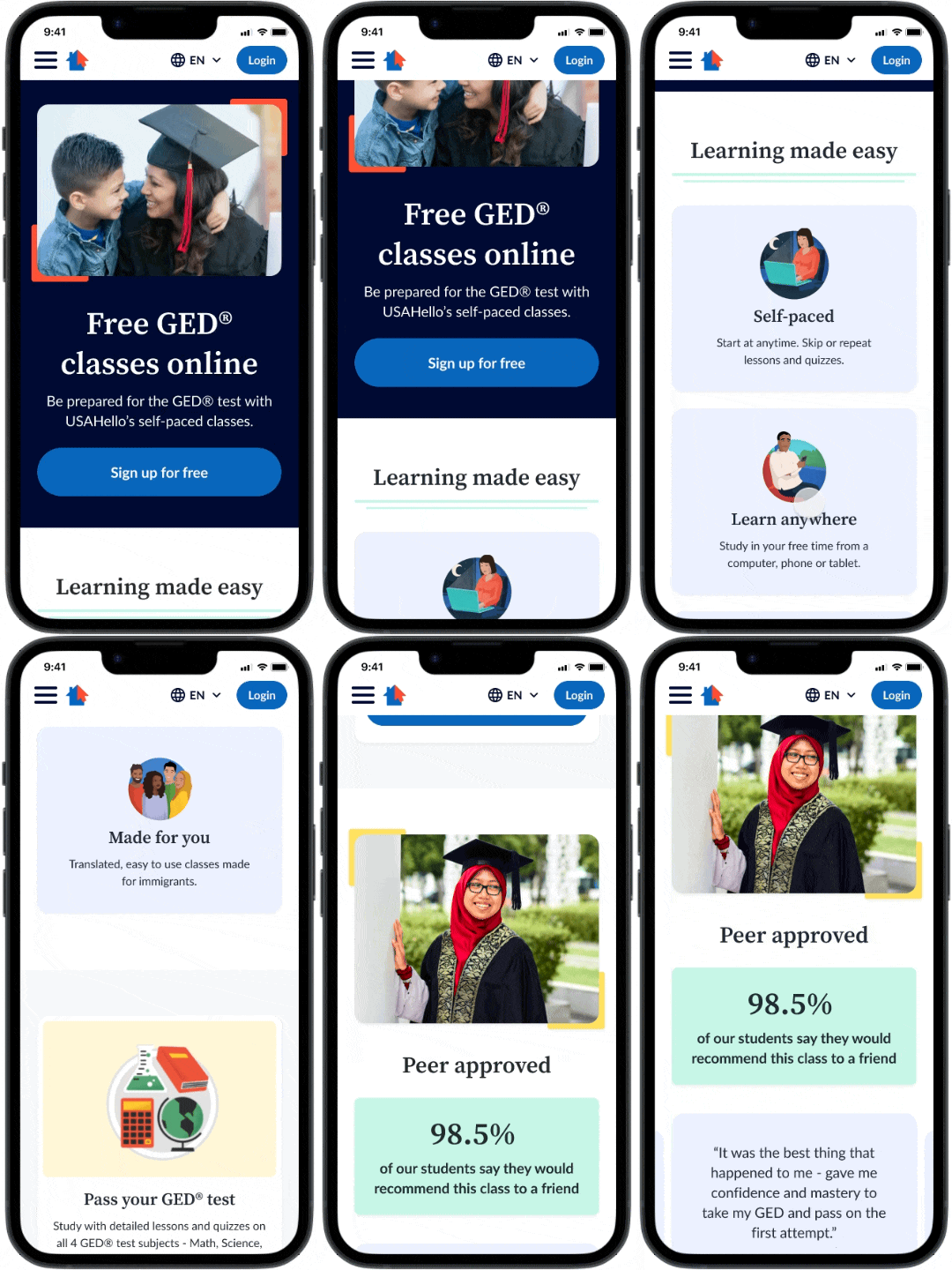
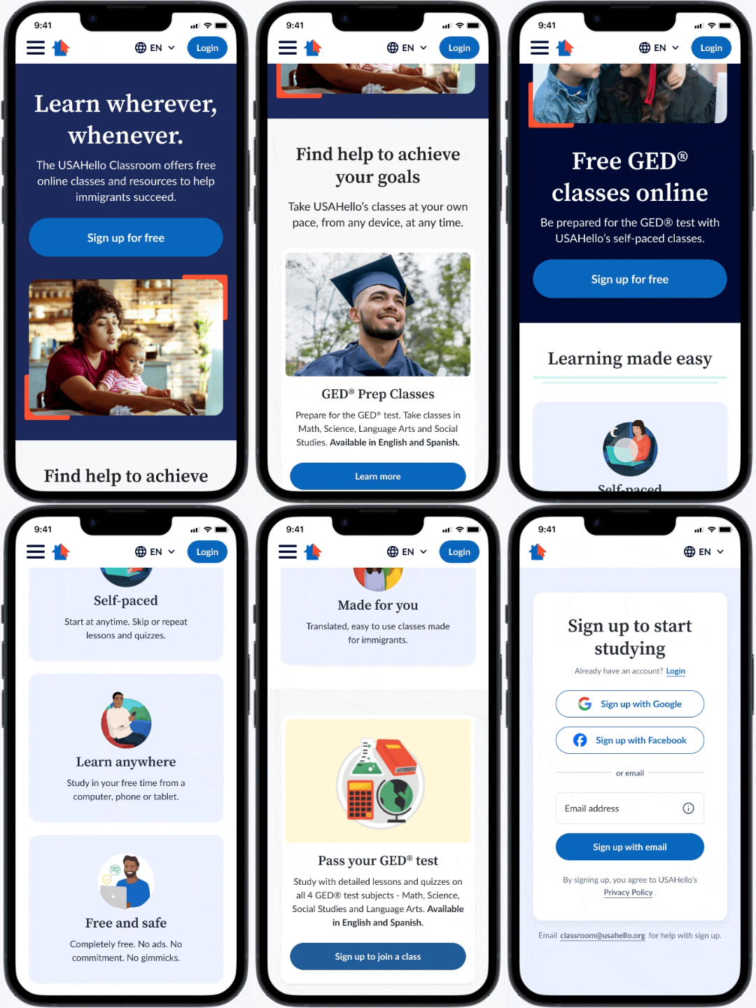
Logged out GED Class page with emphasized social proof and CTAs directing learners to sign up.
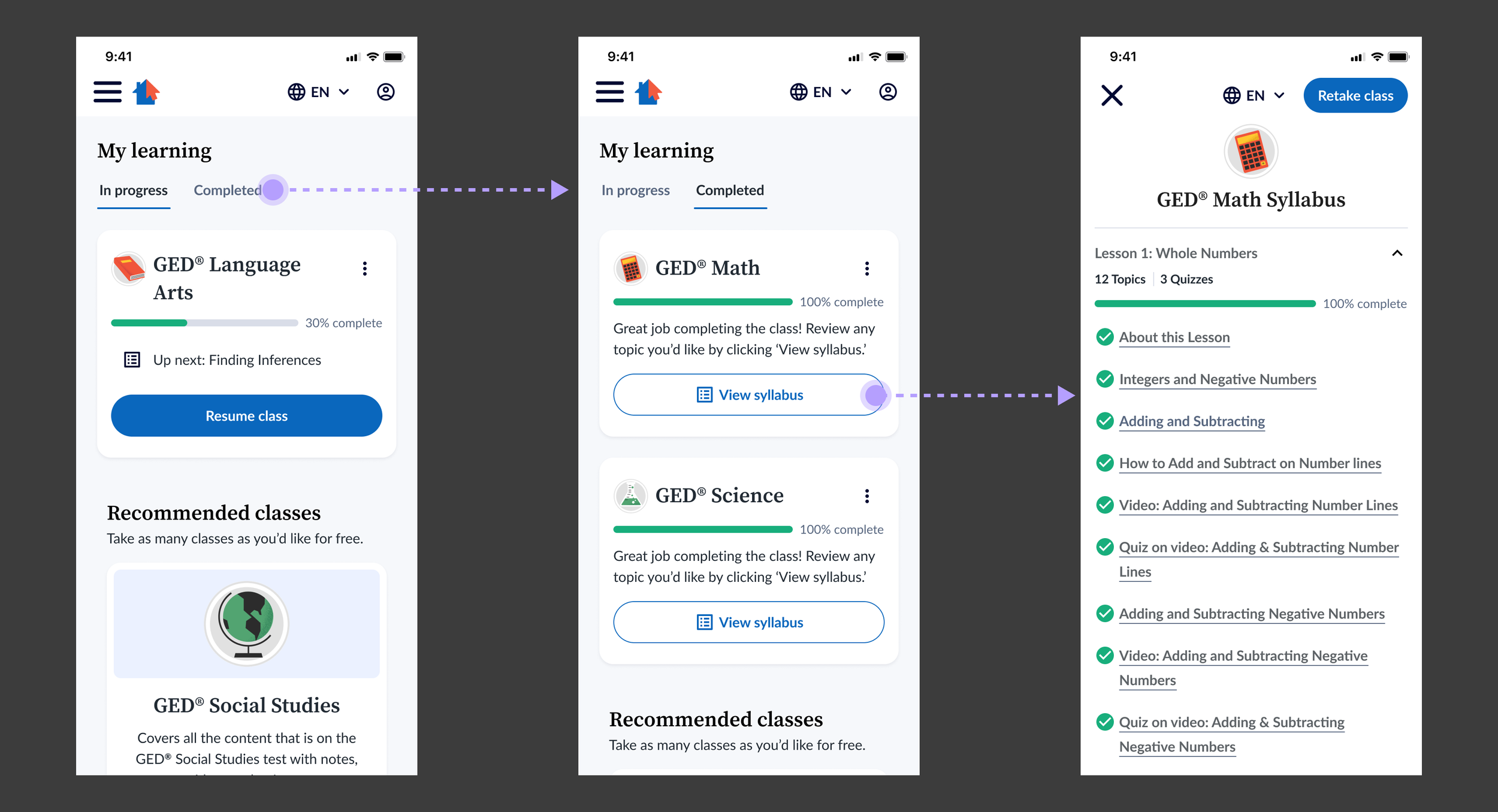
Logged-in “My Learning” dashboard makes it easy for learners to join classes and track their progress.
Impact
In the six months post launch of the new site, the Classroom saw the following positive impacts:
59% increase in average monthly enrollments
1.2% increase in class completion rates
Significant decrease in email support requests about the enrollment and sign in process for the Classroom
Design Process
Discovery & Audit
I began by aligning with the USAHello team on their goals for the redesign and concerns with the existing site. The Classroom needed to feel welcoming and trustworthy for recent immigrants, be easy to use for learners with limited digital literacy or mobile-only access, and clearly connect to the broader USAHello ecosystem while still standing apart as a distinct product.
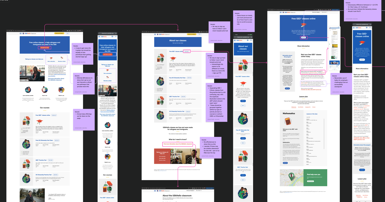
I then audited the existing experience, which revealed major usability issues. The information architecture was confusing, pages were overly text-heavy and duplicative, and mobile responsiveness was a serious blocker to usage.
Auditing the current site content allowed me to build empathy with learners and identify pain points.
Design Strategy
I structured the redesign around three key moments in the learner journey: discovering classes while logged out, signing up, and engaging with classes once logged in. This helped focus design decisions on reducing friction at the moments that mattered most.
I worked closely with content and engineering partners to define a clearer IA, explore early branding directions, and understand the constraints of the underlying platform (LearnDash). Starting brand conversations early was intentional, as I didn’t want to leave alignment on a new visual look and feel for the site to the end of the design process, potentially slowing down hand-off.
Logged-Out Experience
The logged-out experience was designed to be simple and reassuring, funneling learners toward sign-up in order to access free course material. I emphasized social proof and FAQs on class landing pages using learner quotes and survey data to build trust.
Because much of the Classroom traffic arrived via organic search to individual class pages, key information was intentionally repeated across pages to ensure learners could understand what the Classroom was regardless of entry point.
Landing pages emphasize answers to common learner misconceptions and provide clear sign up CTAs.
Sign-Up & Onboarding
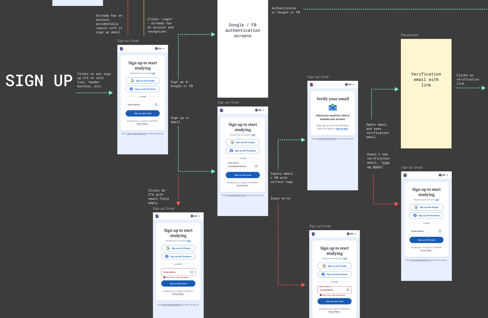
I kept the sign-up flow as streamlined as possible and significantly reduced the amount of personal information required to create an account. USAHello’s research shows that many learners - particularly those with insecure legal status - were hesitant to share identifiable data, such as full names, online.
However, I included SSO options (Google and Facebook) to reduce friction for those who were comfortable linking accounts. For non-SSO users, only an email address is required, with verification in place to support account recovery and reduce password-related support issues.
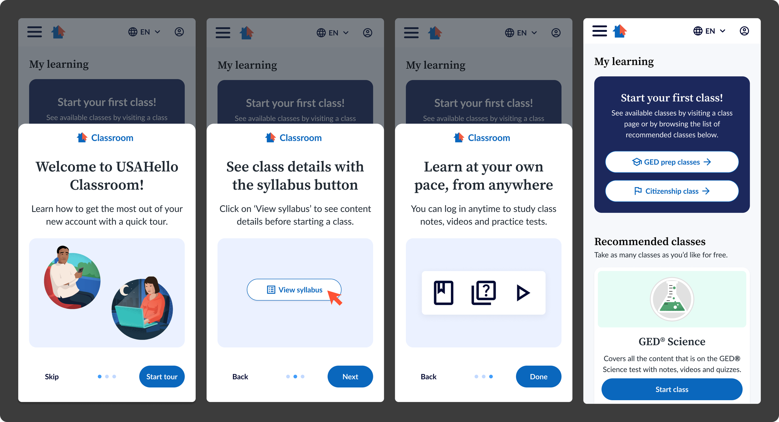
Post–sign-up onboarding was optimized for mobile and focused on answering common questions while guiding learners to start their first class. Empty states in the “My Learning” dashboard, along with recommended classes, help drive early activation.
I mapped out simple flows for sign up and login, as well as a way to reach out to support if users got stuck.
Simple optional onboarding helps new users orient themselves to the My Learning dashboard and jump into learning as quickly as possible.
Class Experience
Before starting each class, learners are now guided through a brief onboarding flow focused on key decisions, such as language selection and whether proof of enrollment was needed.
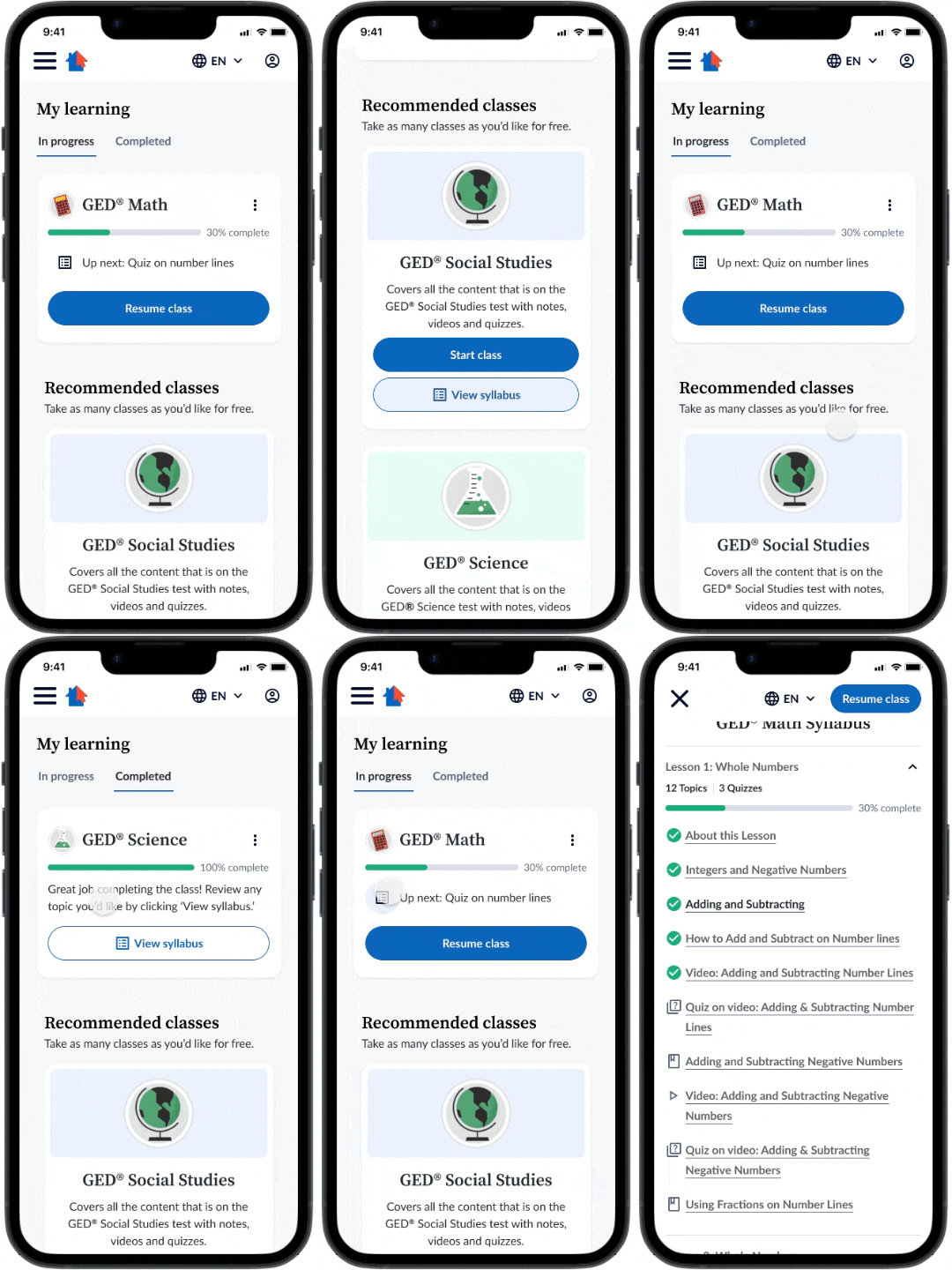
I also introduced a syllabus-based navigation system that makes it easy to jump between sections or re-enter where a learner left off. The “My Learning” dashboard serves as the logged-in home, allowing learners to track progress, resume active courses, discover new offerings, and review completed classes.
A simple My Learning dashboard allows learners to jump back into classes and even review previously completed classes as needed.
What’s Next
After the successful launch in late 2024, USAHello expanded its content strategy to include short, single-session learning modules alongside longer-term courses like GED preparation.
I’ve since been re-engaged by USAHello to lead Classroom V2, focusing on increasing retention and course completion, improving access to learning without requiring sign-up, and balancing short-form and long-form educational experiences. The V2 Classroom is expected to launch in mid-2026.

